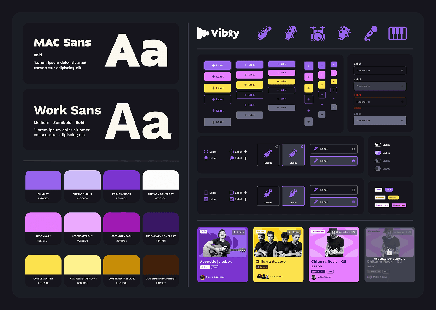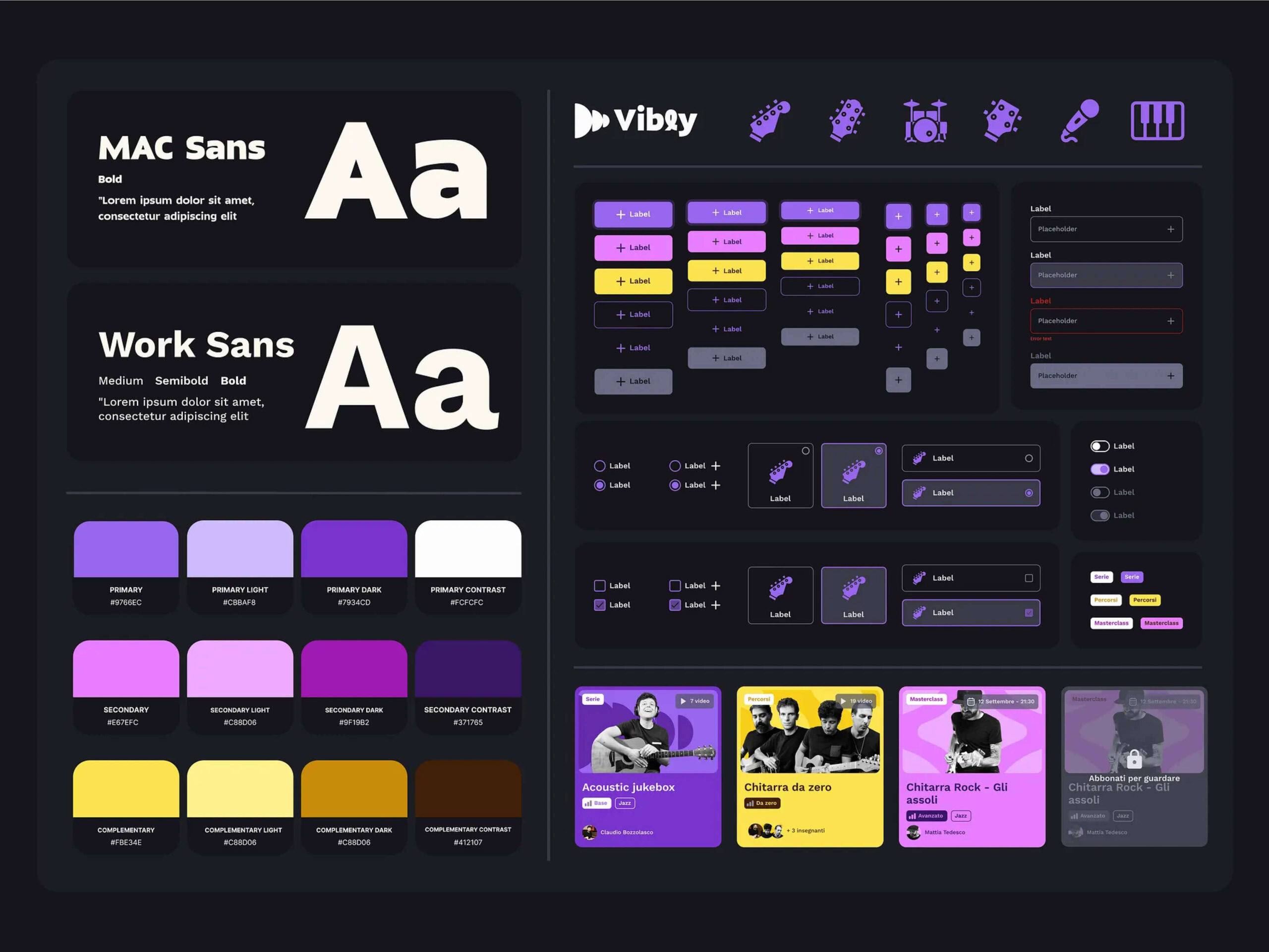
Vibly
Redesign of a platform for learning and improving musical skills
Show case history
Case History
A journey through the redesign of a music learning platform: how I transformed the user experience to make it more accessible, engaging, and effective.
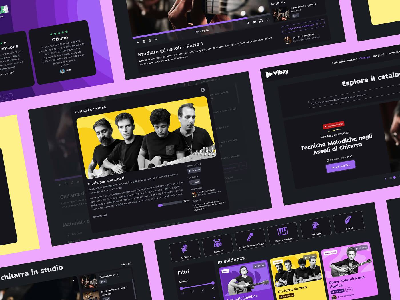
Vibly.tv is a platform dedicated to online music learning. Its goal is to offer professional courses taught by top Italian musicians, helping both beginners and advanced players improve their skills. Before the redesign, the platform presented significant challenges that reduced user engagement and long-term retention.
After a detailed analysis of the existing user experience and the feedback collected, we identified four main pain points:
Users struggled to find courses suited to their level and goals.
There was no initial guidance, leading to high early drop-off.
The lack of progress tracking and incentives reduced motivation over time.
Learning materials were poorly organized, creating a fragmented experience.
How can we create a smoother and more engaging journey for users?
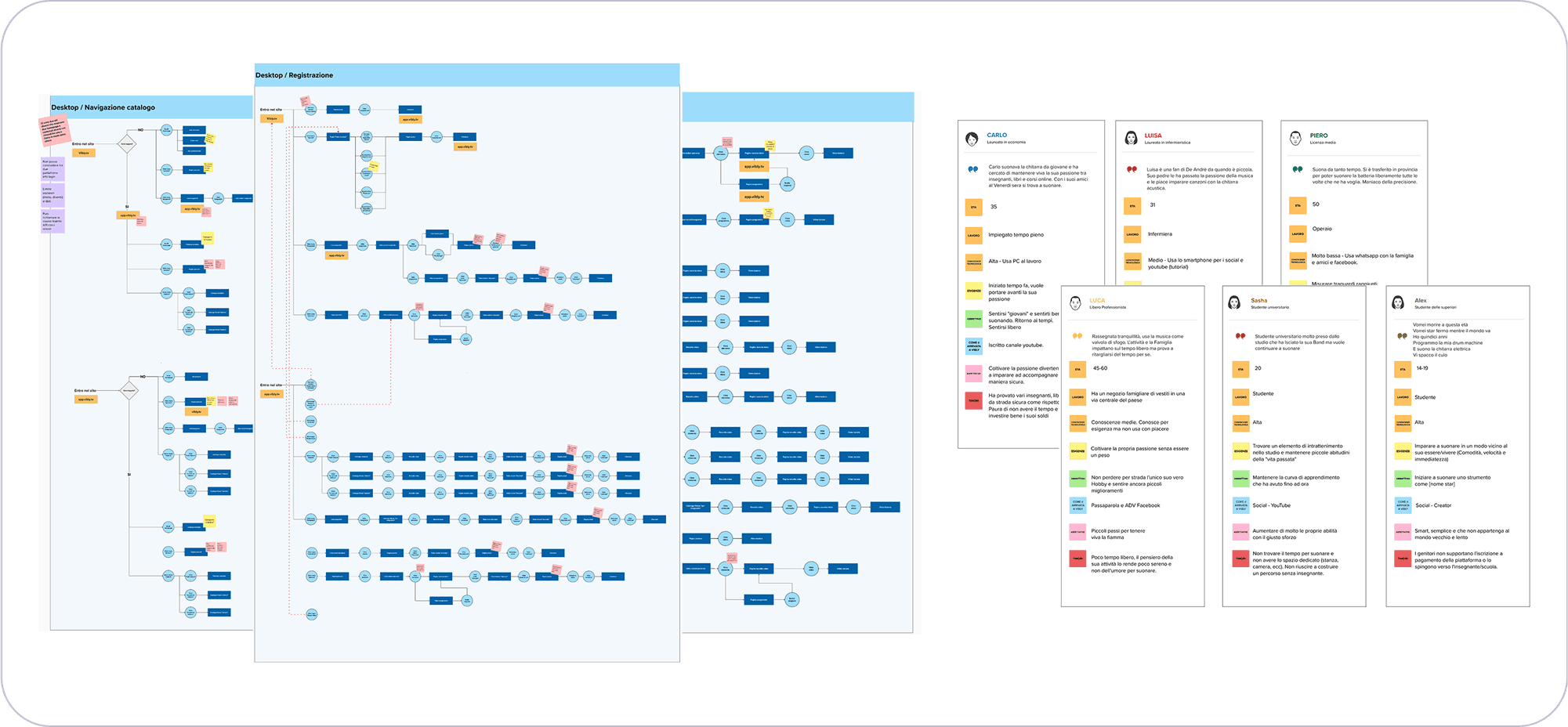
User flow analysis before the redesign and personas
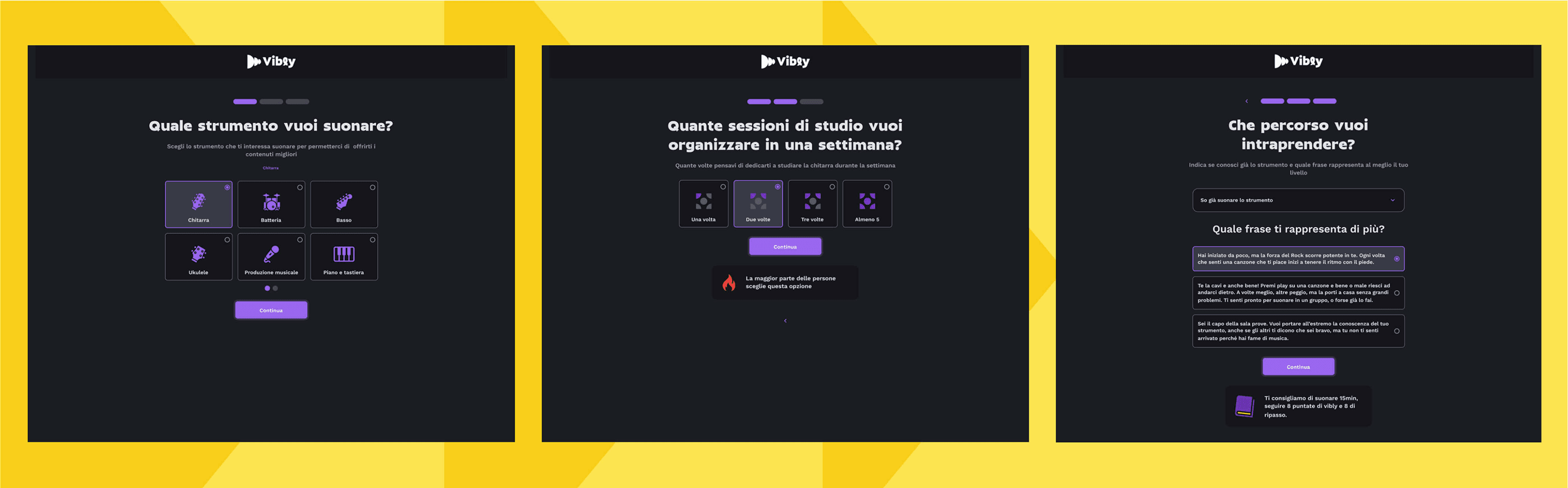
We designed a three-step onboarding flow to guide users from the very beginning:
Instrument selection → The user chooses what they want to learn.
Weekly study sessions → They define how often they plan to practice.
Learning path → They describe their level and goals through guided prompts.
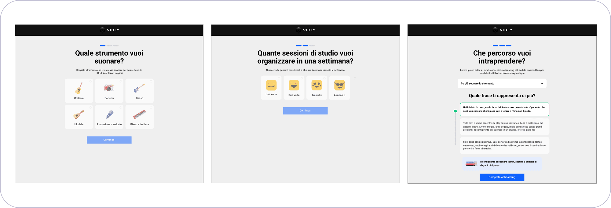
Wireframes of the onboarding flow
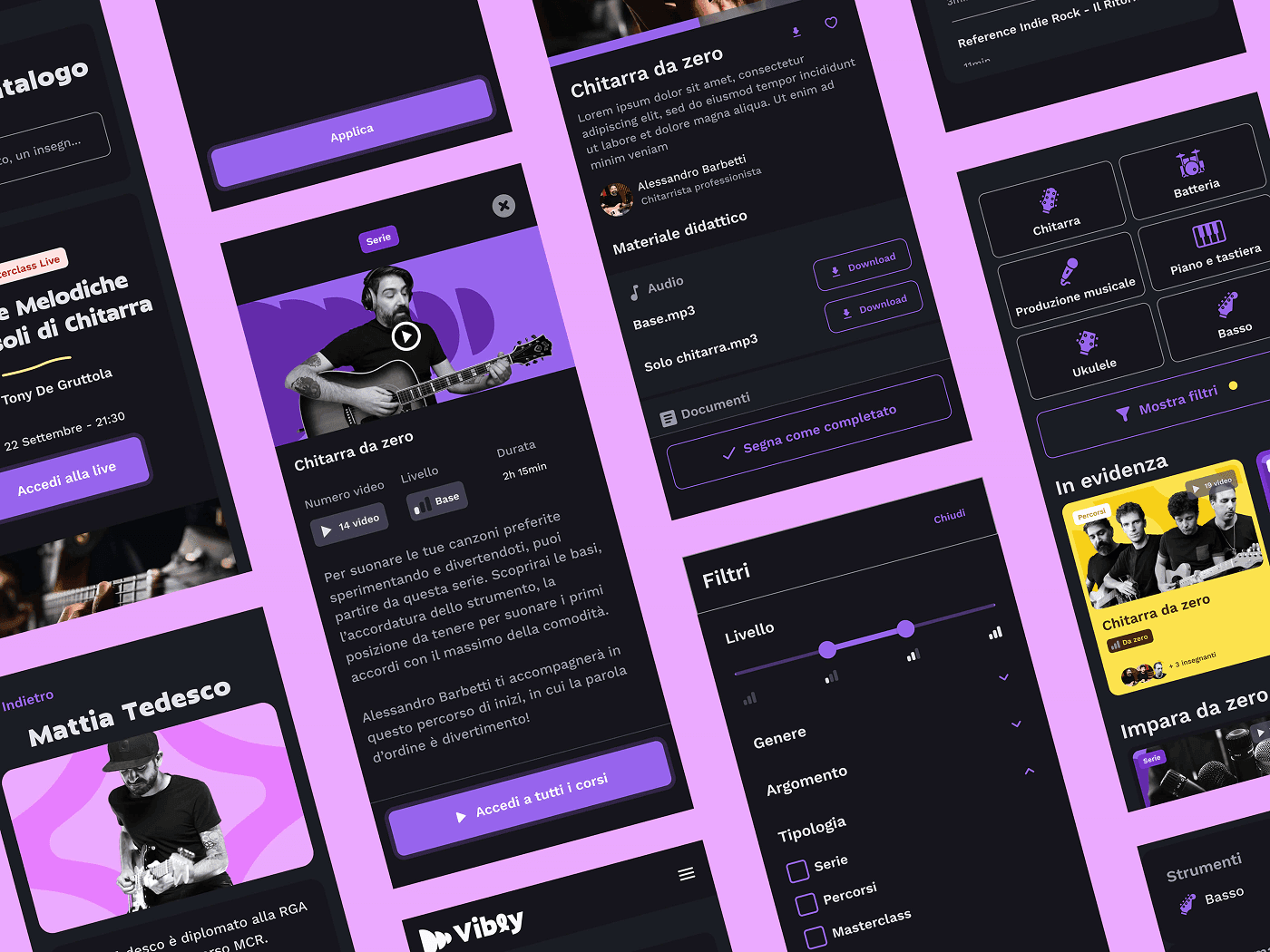
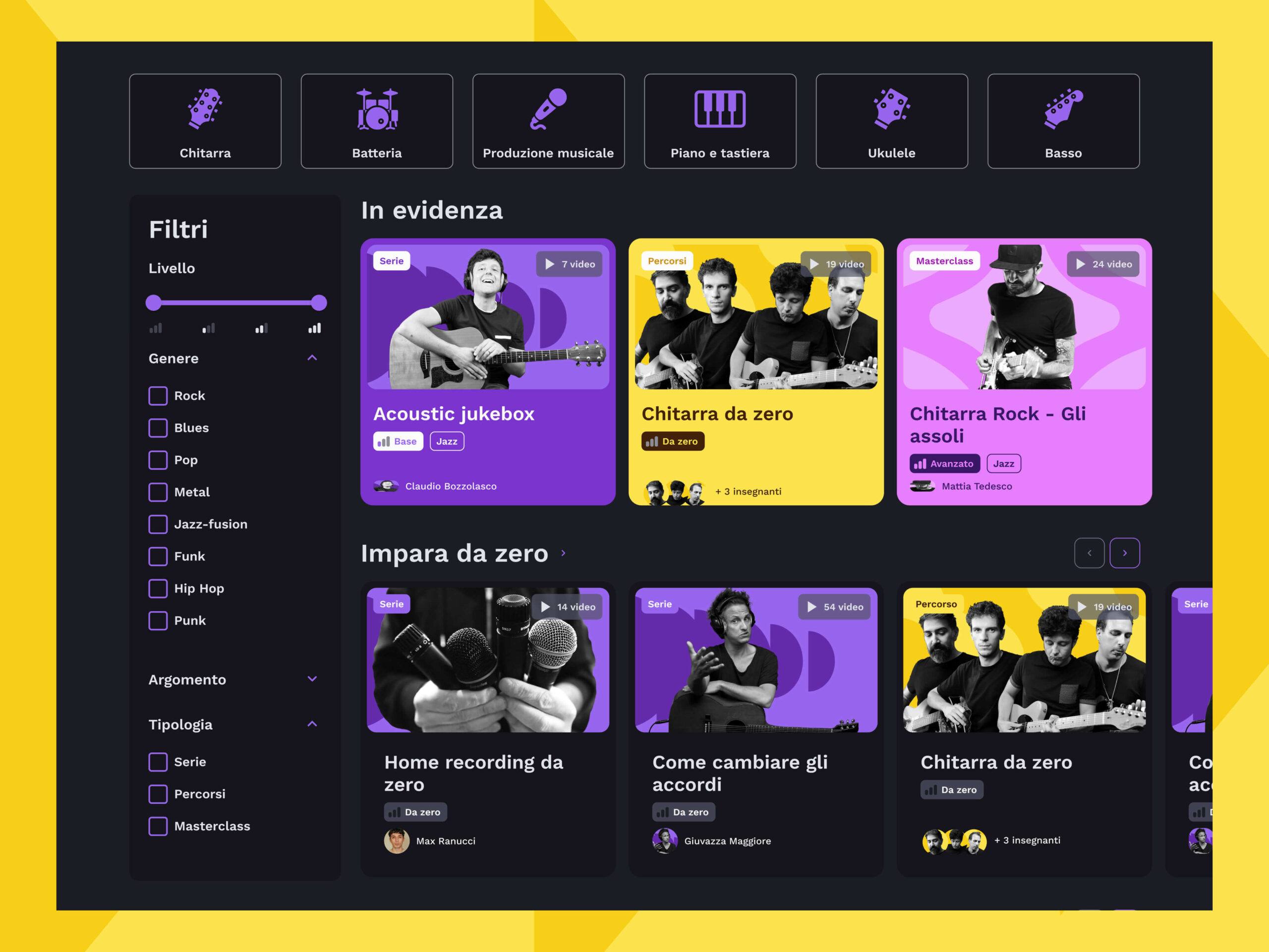
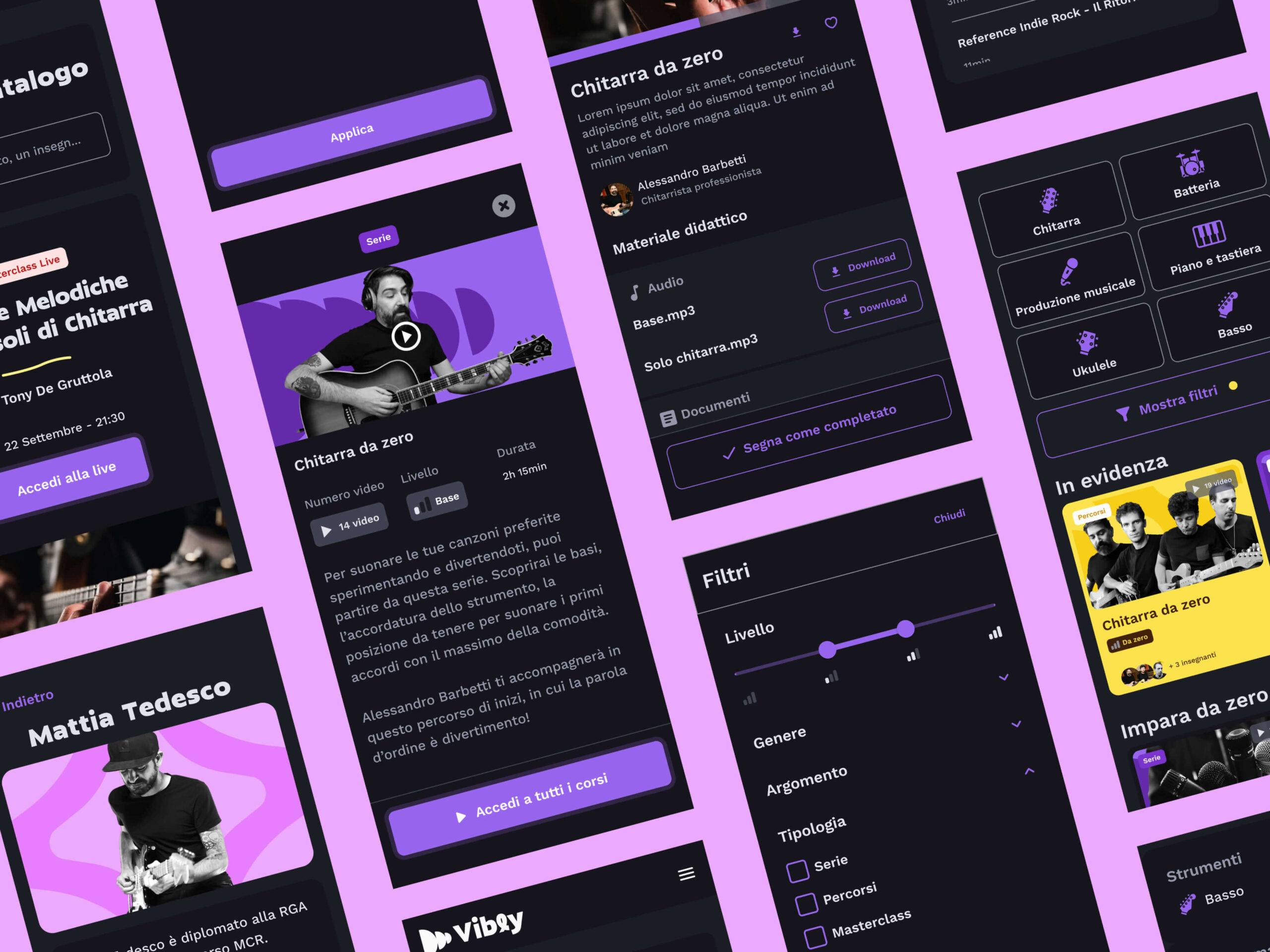
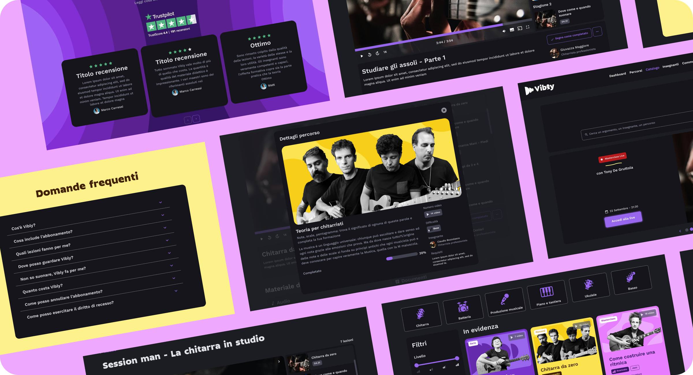
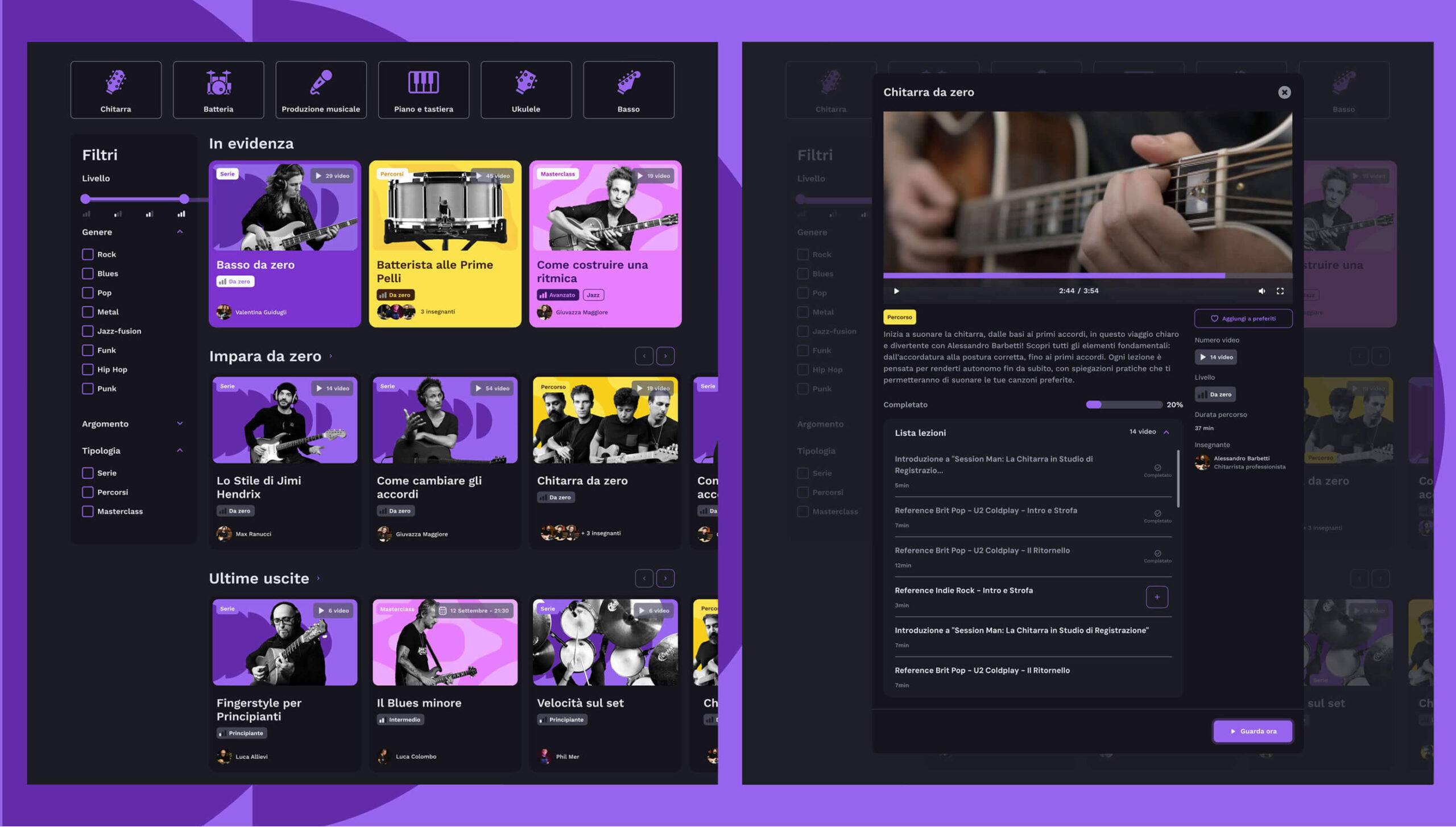
Clear filters by instrument, level, and music genre
Personalized sections such as "Continue watching" and "Recommended for you"
A more readable layout with quick previews
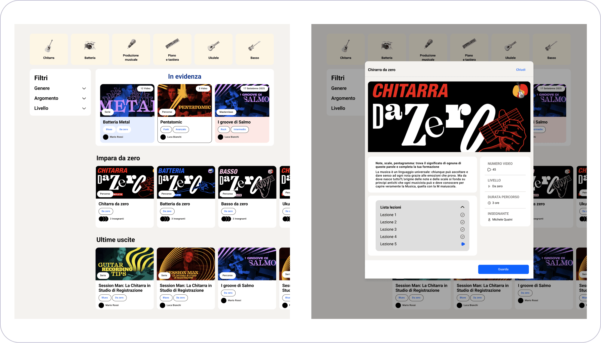
Wireframe of the catalog page and detail modal
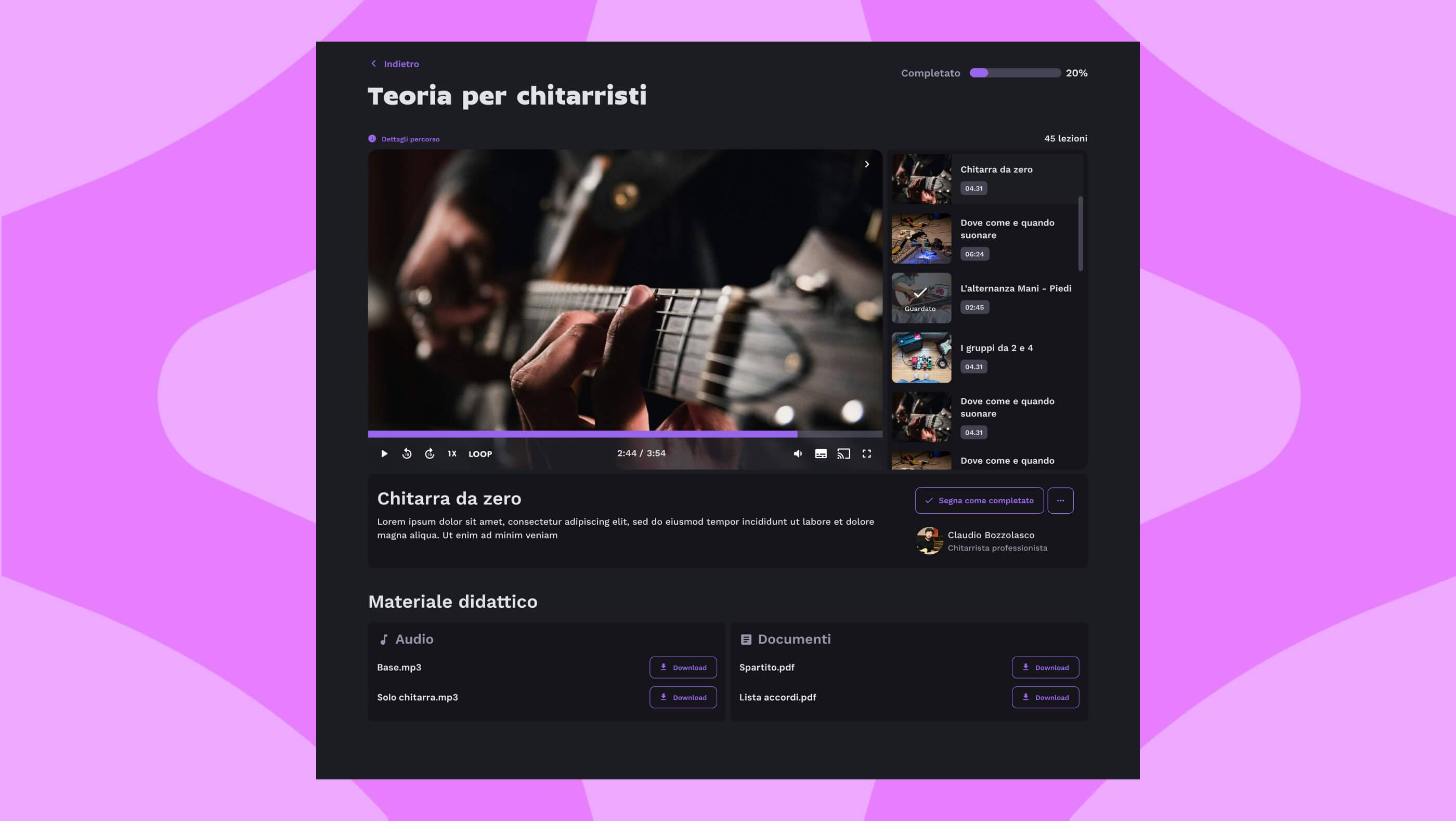
Playback speed controls and looping on specific sections
Learning materials accessible directly from the player
Progress tracking with automatic suggestions
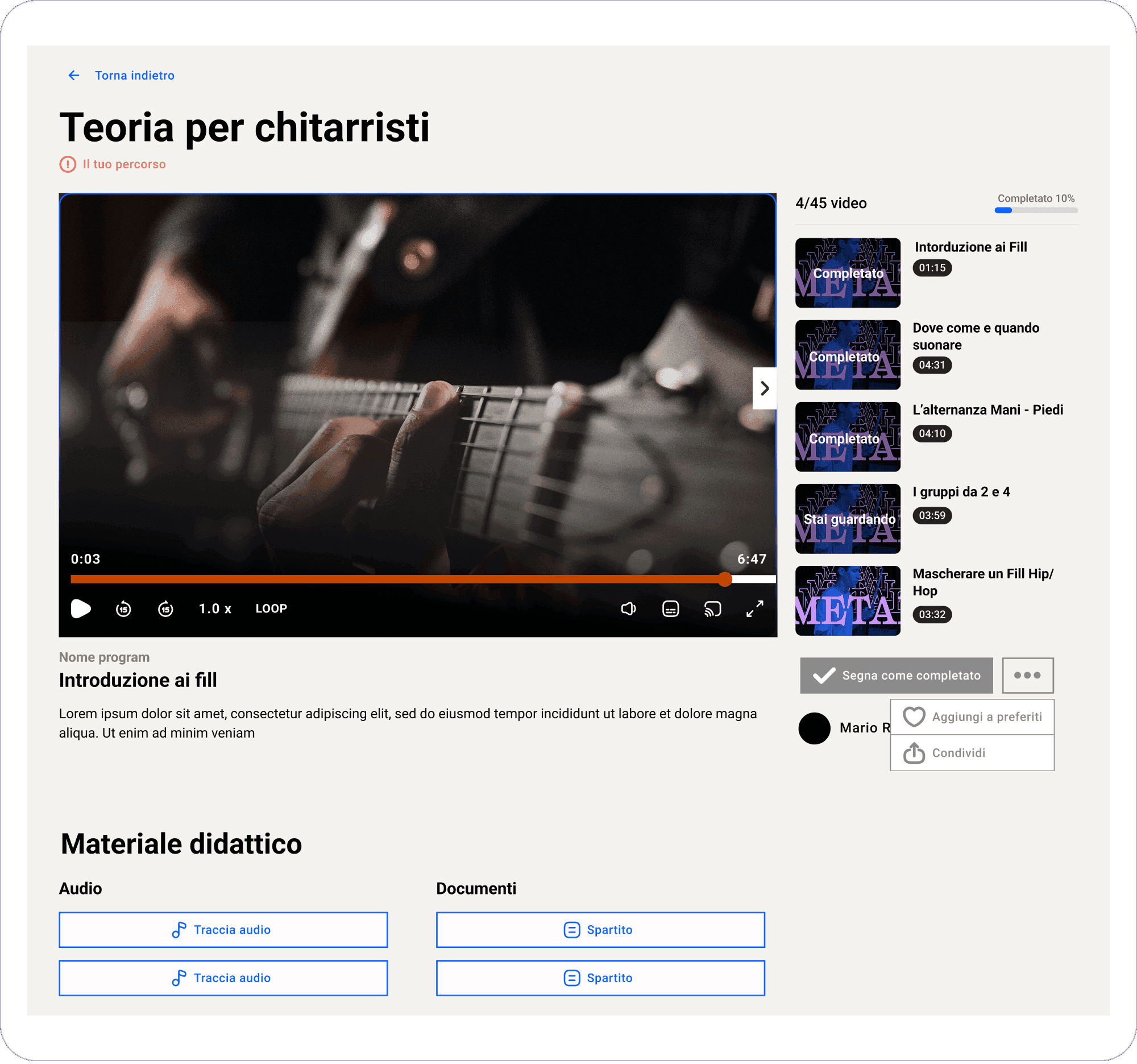
Player wireframe
Average time spent on the platform
30-day retention
Drop in early abandonment
Effective onboarding reduced the drop-off rate.
Personalization made the catalog easier to explore.
Higher interaction increased overall engagement.